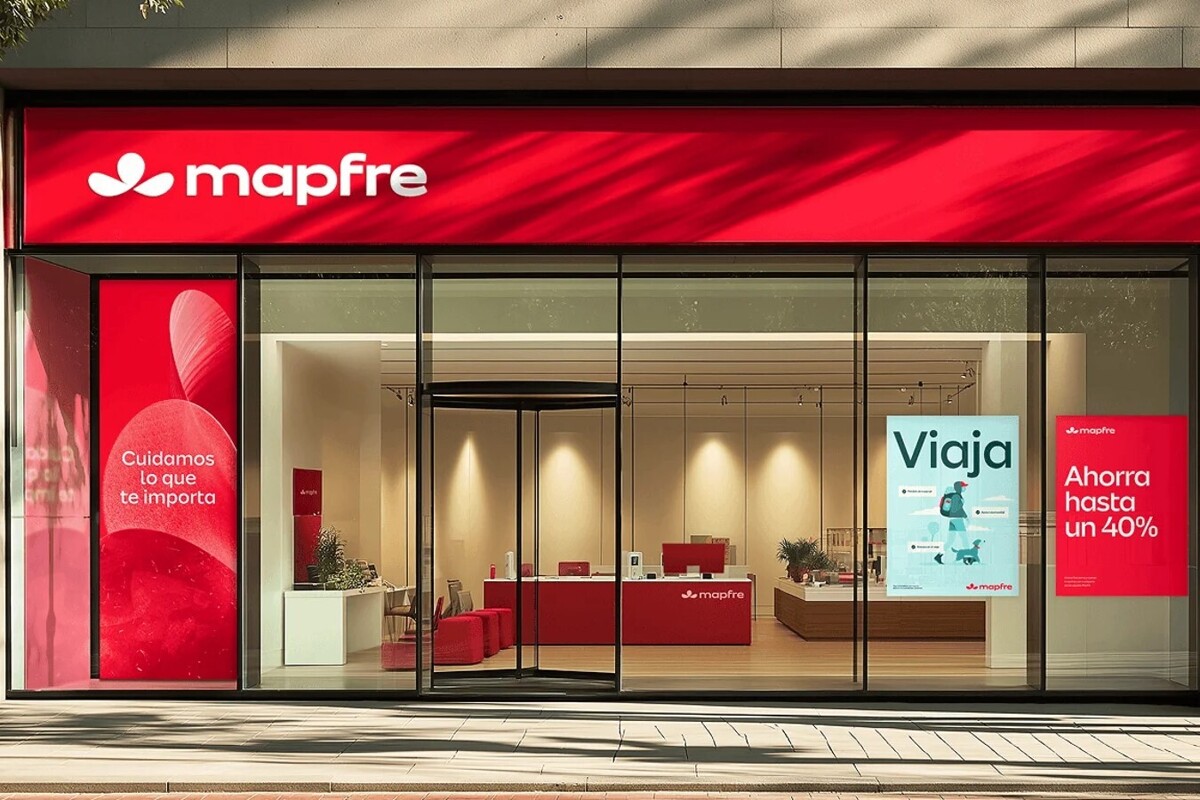
The multinational insurer MAPFRE has announced the global renewal of its brand identity for the digital environment. This evolution is part of an internal transformation process aimed at strengthening its competitiveness and bringing it closer to its customers through a modern positioning in the digital realm. The visual renewal includes the evolution of the traditional red color to a more vibrant tone, the redesign of its iconic clover, and the use of lowercase letters in the logo. The deployment of the new image will be carried out gradually over the next three years in the more than 40 countries where the firm operates directly, including Panama. The process covers more than 4,600 offices, digital platforms, corporate buildings, and specialized units in reinsurance and large risks. The implementation strategy prioritizes local adaptation in each market to ensure that the identity is relevant and consistent with the particularities of each country. Antonio Huertas, president of MAPFRE, stated that the company is today a different entity than it was a decade ago, having transformed to compete better in a connected world without ceasing to prioritize people. This new identity accompanies the company's efforts to strengthen its relationship with its policyholders through personalized and simplified solutions.